
Website Call to Action Examples That Get Calls
Most visitors leave without clicking anything. Here's how I design calls to action that turn Edmonton website visitors into calls and quote requests.

You’ve worked hard to get people to your website. Maybe they found you on Google, clicked an ad or got your name from a friend. But many visitors leave without clicking anything. They look around, they aren’t sure what to do next and they go back to their search results. A clear call to action is often the difference between a visitor who leaves and one who calls. Here’s how I design calls to action that get clicked, with examples you can use on your own site.
What Is a Call to Action?
A call to action (CTA) is anything on your website that asks a visitor to take the next step. Usually it’s a button or a link, like “Get a Free Quote,” “Call Now” or “Book an Appointment.” The action is whatever moves a visitor closer to becoming a customer.
Most websites need two kinds of CTAs:
- Primary CTA. This is the main action you want visitors to take, the one that brings in business. For a roofer, it might be “Get a Free Roof Inspection.” For a restaurant, it might be “Order Online.” Your primary CTA should be the most visible button on the page.
- Secondary CTA. This is a lower-commitment option for visitors who aren’t ready yet, like “See Our Work” or “View the Menu.” It keeps them on your site and moving toward the primary action.
The primary CTA should always win the visual contest. If your secondary buttons look just as important, visitors have to stop and decide, and many won’t.
Three Rules for CTAs That Get Clicked
Getting someone to click is harder than it looks. People don’t like committing to something when they’re not sure what they’re getting. These three rules make the decision easy.
Make It Look Clickable
If a visitor doesn’t recognize something as a button, they won’t click it. Buttons should look like buttons: a solid shape, a strong colour that contrasts with the background and enough padding to tap easily with a thumb. Use the same style for your main buttons across the whole site, so visitors learn what to look for. Plain text links buried in a paragraph are easy to miss.
Say What Happens Next
People don’t click when they don’t know where a button will take them. The button text should say exactly what they’ll get. “Submit” and “Click Here” tell the visitor nothing. “Get My Free Quote” or “Call for Same-Day Service” tells them exactly what happens when they click. A short line next to the button, like “No obligation. We’ll reply within one business day,” can remove the last bit of doubt. Only promise what you can actually deliver.
Match What the Visitor Wants
The best CTA is the one that matches why the visitor came. Someone who found you through a referral has probably already decided to contact you, so give them a prominent “Contact Us” or phone number right away. Someone comparing options might not be ready to call yet, so offer something smaller first, like “See Our Prices” or “View Our Work.” Think about who’s on each page and what they’re looking for, then give them the next step that fits.
Good vs Weak CTA Examples
Here are some common weak CTAs and stronger versions:
- Weak: “Submit.” Better: “Get My Free Quote.”
- Weak: “Click Here.” Better: “See Our Kitchen Renovations.”
- Weak: “Learn More.” Better: “See How Our Cleaning Plans Work.”
- Weak: “Contact Us.” Better: “Book Your Free Consultation.”
- Weak: “Send.” Better: “Send My Request.”
- Weak: “Our Services.” Better: “Find the Right Service for Your Home.”
- Weak: A phone number written as plain text. Better: A “Call (780) 555-0123” button that dials with one tap on mobile.
The pattern is the same every time. Strong CTAs are specific, use action words and often speak from the visitor’s point of view, like “my” quote instead of “your” quote.
Where to Put Your CTAs
A great CTA in the wrong place won’t get clicked. Here’s where I place them on most small business websites:
- The header. A button or phone number in the top navigation, visible on every page. A header that stays at the top of the screen as visitors scroll keeps the CTA in reach at all times.
- The hero section. The first thing visitors see when a page loads should include your main CTA. Many visitors decide within seconds whether to stay, so don’t make them scroll to find it.
- After your services. Once someone has read about what you offer, give them a way to act on it right there.
- The end of the page. Visitors who scroll all the way down are interested. Finish every page with a clear CTA so they don’t hit a dead end.
- Click-to-call on mobile. Many local customers search on their phones. Make your phone number tap-to-call, and consider a call button that stays visible at the bottom of the screen on mobile.
CTAs for Different Types of Businesses
The right CTA depends on how your customers like to buy.
Trades and Home Services
People often need a plumber, electrician or roofer fast. Make calling easy: a tap-to-call phone number in the header, a “Get a Free Quote” button in the hero and a short quote form. If you offer emergency service, say so in the CTA, like “Call for 24/7 Emergency Service.”
Restaurants
Restaurant visitors usually want one of three things: the menu, a way to order or a way to book a table. Make those the CTAs: “View Menu,” “Order Online” and “Book a Table.” Put them at the top of every page, and make your phone number and address easy to tap on mobile.
Professional Services
Accountants, lawyers and consultants are selling trust, and clients rarely hire on their first visit. A softer primary CTA often works better, like “Book a Free Consultation” or “Schedule a Call.” Secondary CTAs like “See How I Can Help” or “Read Client Reviews” keep visitors learning until they’re ready.
A Real Example
Here’s a real example from the website I redesigned for All India Restaurant & Sweets.
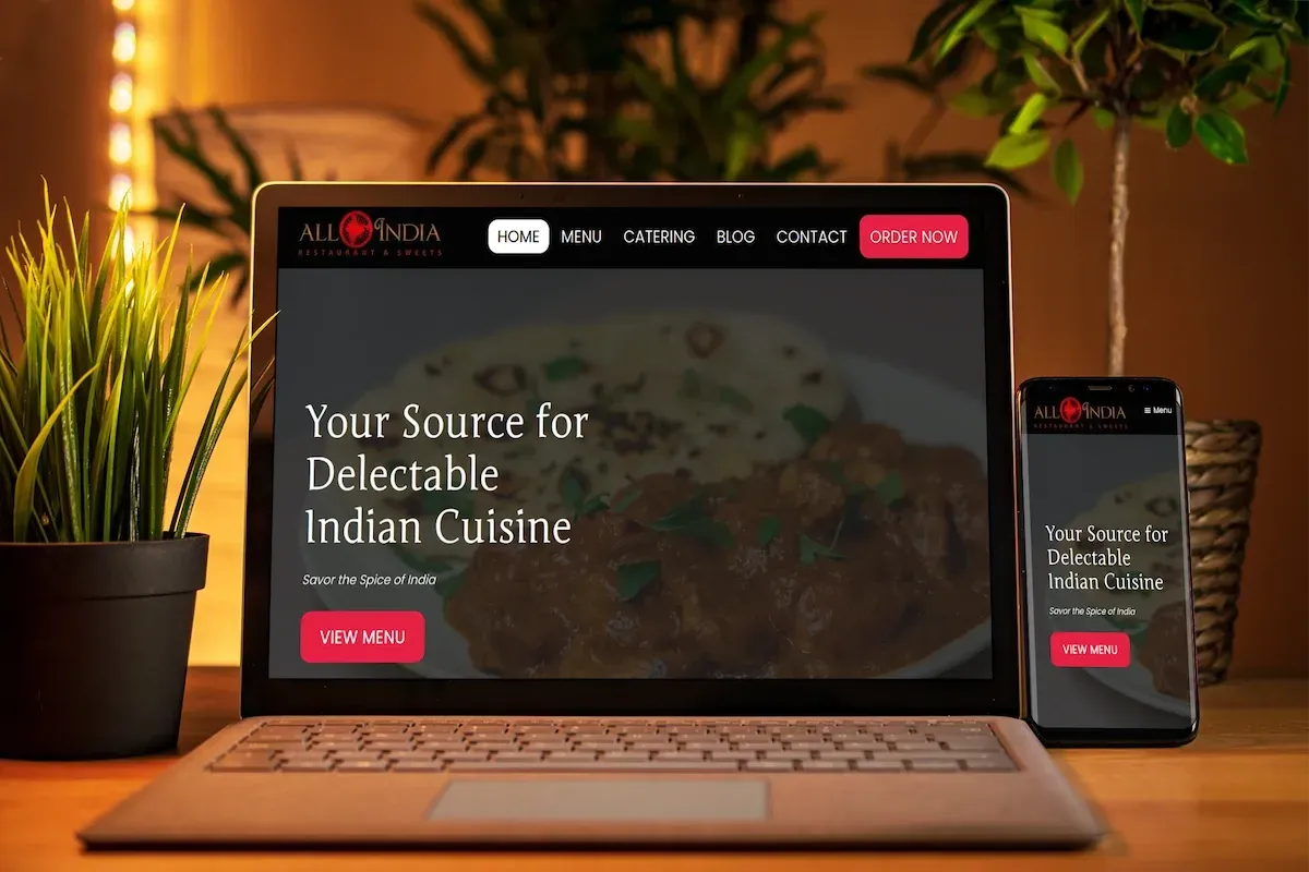
Notice how the CTAs follow the rules above:
- The primary action is always visible. “Order Now” sits in the navigation bar at the top of the page, so visitors can order from anywhere on the site.
- The hero has one clear next step. The main section has a single button, “View Menu,” which matches what most restaurant visitors want first.
- The buttons look clickable. Both use the same bold red, which stands out clearly against the dark background.
- The button text says what happens. “View Menu” and “Order Now” leave no doubt about where each one goes.
- It works on mobile. On the phone version, the “View Menu” button stays front and centre in the first screen.
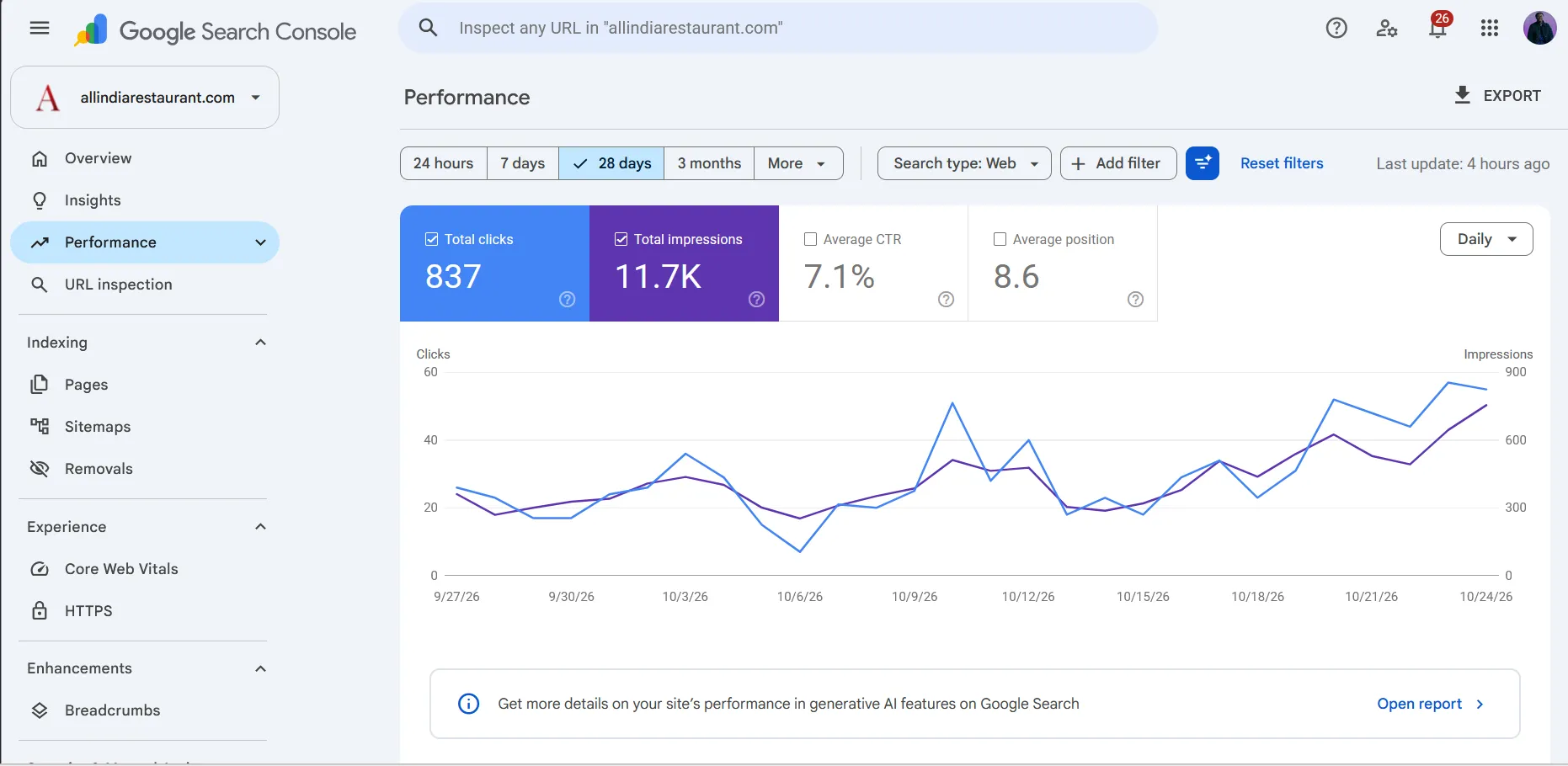
Today the site gets about 11,000 impressions a month in Google search and 837 visitors a month. Clear CTAs make sure those visitors know exactly what to do once they arrive.
Put Your CTAs to Work
A clear call to action is one of the simplest ways to get more calls from the visitors you already have. Know who’s visiting, give them a reason to trust you and then make the next step obvious.
CTAs work best on a site that’s already getting found. If you’re working on that too, read how I get Edmonton business websites ranking on Google. And if you’re still deciding whether your business needs a proper website at all, start with does my small business need a website?
Want CTAs like these on your own site? I design them into every website I build. See my web design and development services in Edmonton, or get a quote.
Frequently Asked Questions
How many CTAs should a page have?
One main action per page, repeated as often as it makes sense. On a typical service page, I put the main CTA in the header, in the top section and again after each major section. A secondary CTA, like viewing your work, is fine too. What you want to avoid is several different actions all competing for attention.
What colour should my button be?
There's no single best colour. What matters is contrast. Your main button should stand out clearly from the background and from everything else on the page. Pick one strong colour from your brand, use it only for your main CTA and keep it the same across the whole site so visitors learn what it means.
Should my phone number be a CTA?
Yes, especially for trades, home services and any business where customers prefer to call. Put your number at the top of every page and make it tap-to-call on mobile, so a visitor can call you with one tap instead of copying the number.